


Clinton College Rebrand
Case Study
How can you embrace modern design while paying homage to centuries of tradition.
GOALS
Clinton Colleges sought a firm to unify their messaging and identity system under a core brand. They desired a new brand that promotes a modern image of excellence while honoring their storied tradition.
RESULTS
Sababa Design analyzed user profiles and target demographics to create a new identity system for the college. The new logo honors the religious traditions of the college.
SCOPE OF WORK
Brand Strategy
Messaging
Identity System Design
Editorial Design
Marketing Campaigns
The project began with a facilitated discovery session with the Clinton College team. The meeting brought clarity in regards to the brand strategy.
User Profile.
Looking at student demographics, we identified several stakeholders, their pain-points and the value proposition exchange.


The project began with a facilitated discovery session with the Clinton College team. The meeting brought clarity in regards to the brand strategy.
User Profile.
Looking at student demographics, we identified several stakeholders, their pain-points and the value proposition exchange.

Approach.
Brand Attributes

Clinton College is an outstanding choice for higher education.


During the discovery phase, we found many parallels between historic downtown Rock Hill and campus. The Carolina region is renowned for its woven textile manufacturing. The college is very close to old textile plants and it's where many of the earliest alumni began work after graduating.
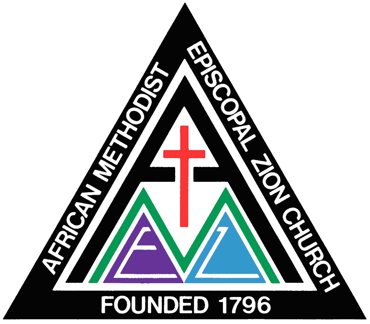
Clinton is an HBCU institution that was founded by the African Methodist Episcopal Zion Church. We wanted to celebrate a larger woven tradition from Carolina to its roots in Africa. Traditional Ugandan Rwenzori basket-weaving used radial design and an earthy color palette. We let their history and tradition influence the design.
Textile plants in Peidmont Region C. 1931.
Courtesy of NCpedia.org


The final mark is a radial design where three C’s are stitched together culminating in a triangle. The mark celebrates a larger woven tradition from Carolina to Africa. Even the colors, gold, maroon, and brown are tributes to the same color used in traditional Ugandan Rwenzori dye.
The triangle at the center represents Clinton’s roots as an African Methodist Episcopal Zion institution. The gold, maroon and beige colors represent intellect, action, and heritage respectively. The colors blend at the center to create a black triangle, which symbolizes how Clinton blends academics, tradition, and community to form a unique campus.
Rwenzori weaving. Courtesy of Daily Kos
AME Zion Logo.
Educational motifs. Harvard.


Before


After


